

Selfdriven is a platform that empowers learners to take ownership of their learning journey. My role was to develop a cohesive brand identity and UX framework that aligned with their values. Fostering curiosity, initiative, and growth.
The Rebranding Challenge: A Fragmented Brand Experience
Selfdriven had multiple domains, scattered branding, and a lack of clarity in its identity. The challenge was to create a brand that resonates with a wide range of audiences—learners looking for self-driven growth, facilitators guiding them, but also learning communities, school principals, educators, and community creators who shape the ecosystem.
The goal was to establish a brand that feels intuitive and inspiring for each of these groups.
Selfdriven before the rebranding.
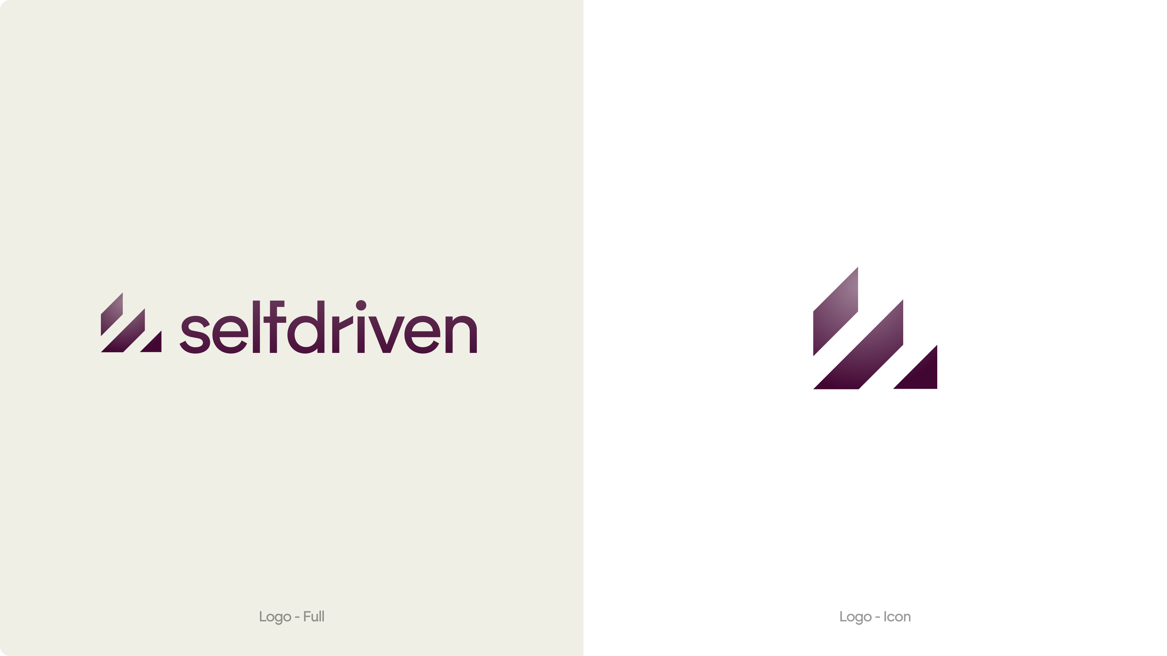
Designing the Logo: A Symbol of Growth
The journey to Selfdriven’s logo began with a broad exploration of themes that reflect learning and personal development. We brainstormed concepts like a rudder (guiding direction), loops (continuous learning), brains (knowledge), and stairs (progress and growth). Each idea had potential, but we ultimately focused on the stairs—a powerful symbol of step-by-step improvement and upward movement.
From this foundation, we crafted an abstract mark that subtly (negative space) represents stairs while maintaining a clean, modern feel. The result is a logo that embodies the essence of Selfdriven: growth, progress, and the journey of lifelong learning.
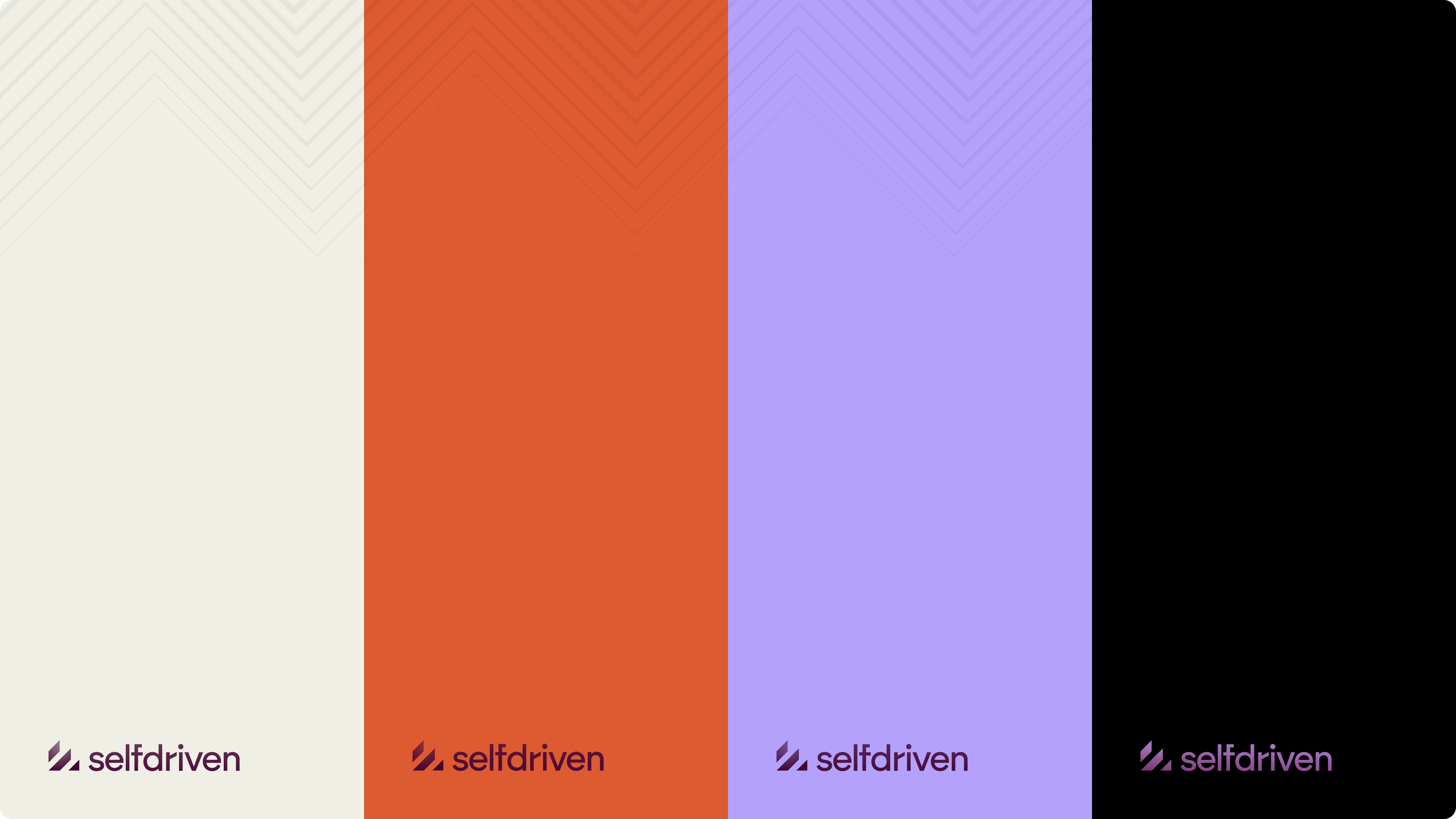
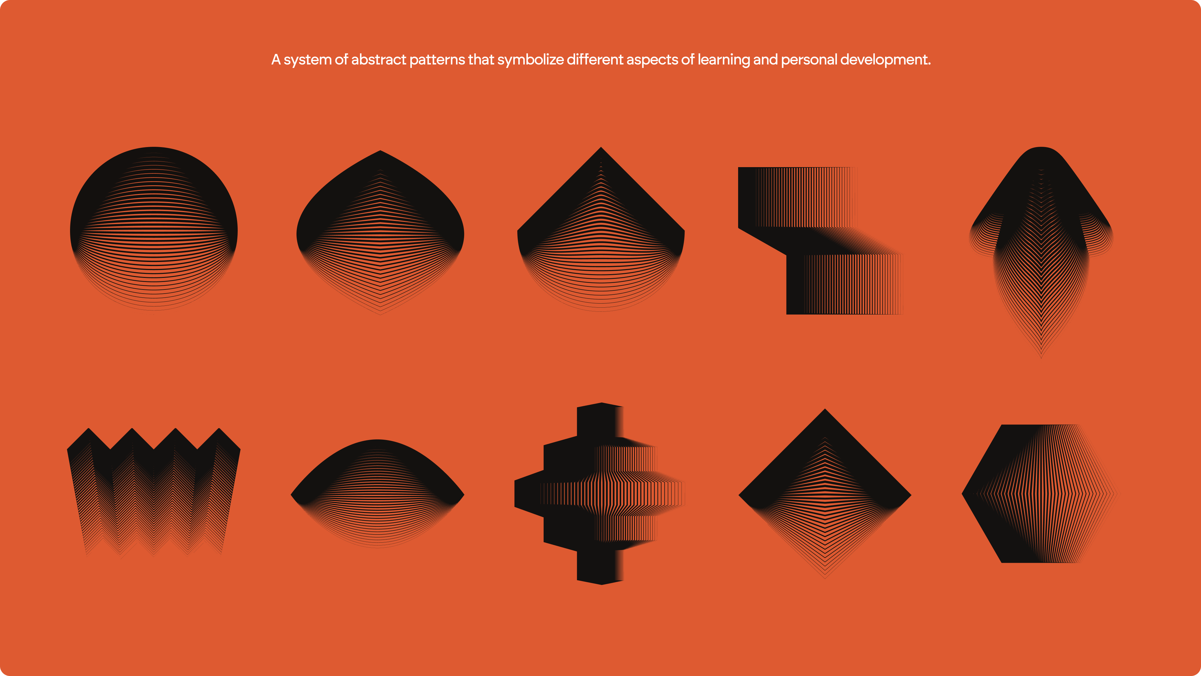
To bring the brand to life, we developed a system of abstract patterns that symbolize different aspects of learning and personal development. Some patterns resemble stairs, representing progress and growth. Others take the shape of an eye, symbolizing curiosity and perspective. Each element was carefully designed to reflect the dynamic, ever-evolving nature of self-driven learning, creating a brand that is both visually engaging and deeply meaningful.
Bringing the Brand to Life
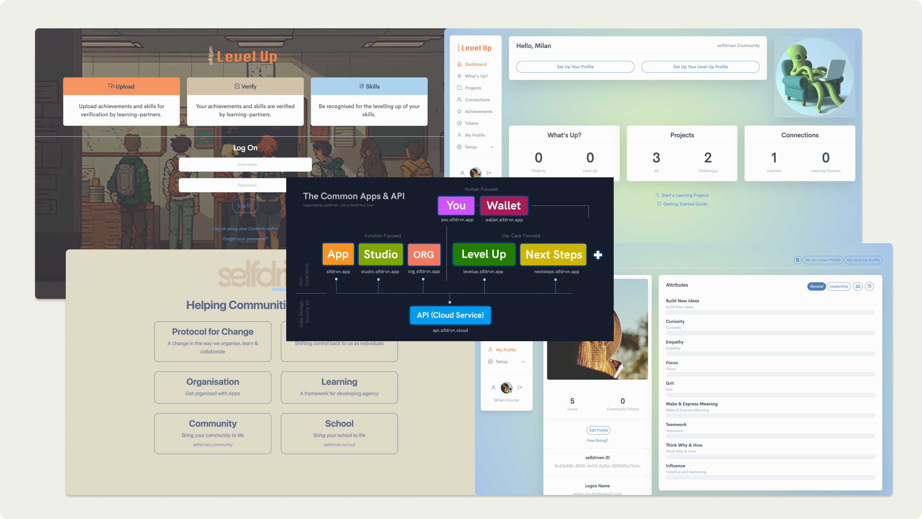
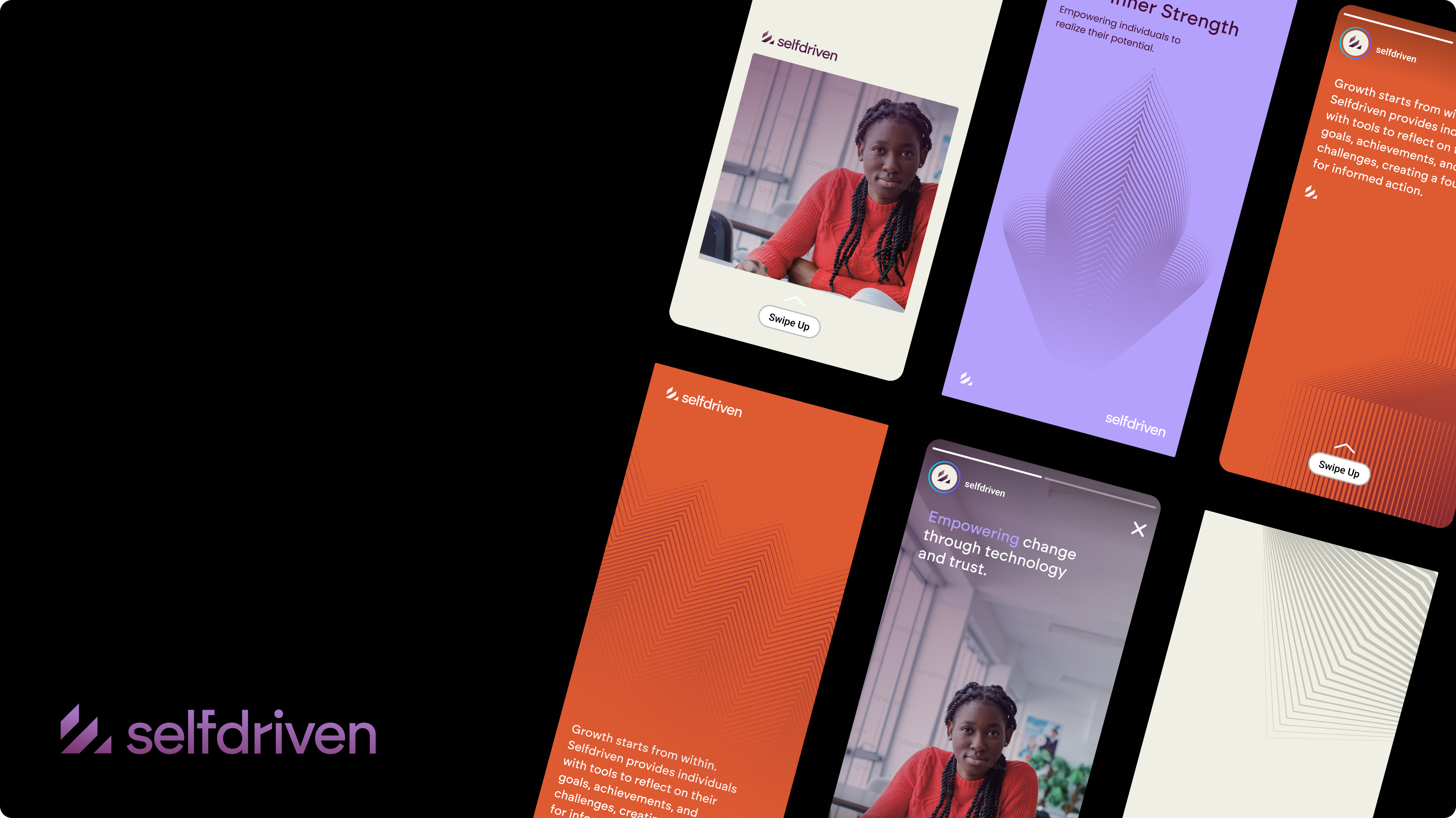
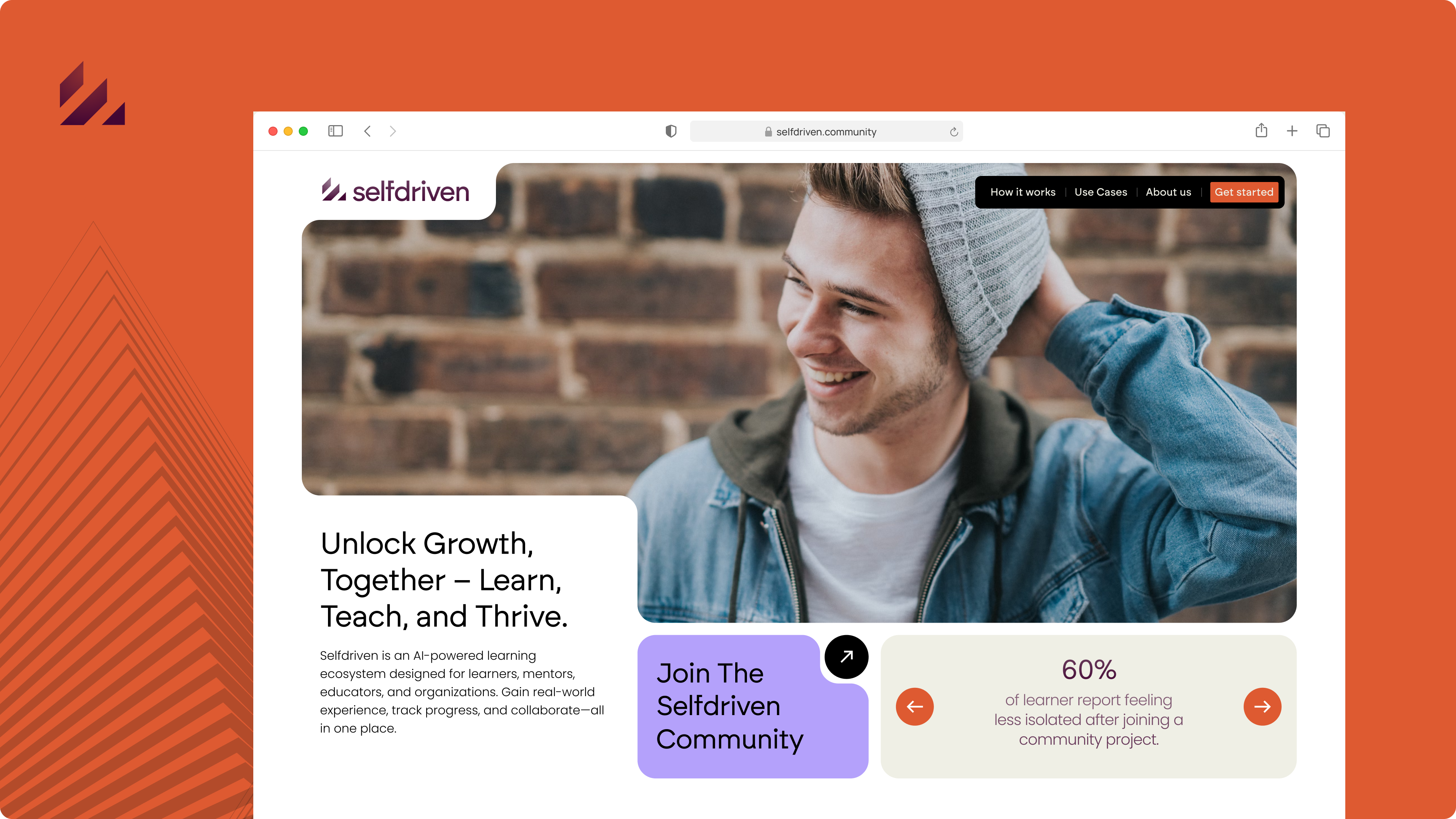
The new Logo, colors and typography translates Selfdriven’s new identity into an engaging digital presence. Using a mix of bold colors and abstract patterns it brings us visuals that feel modern, inspiring, and reflective of personal growth.
Authentic photography ensures a human connection, while the clean layout keeps content accessible and engaging for learners, facilitators, and communities alike.


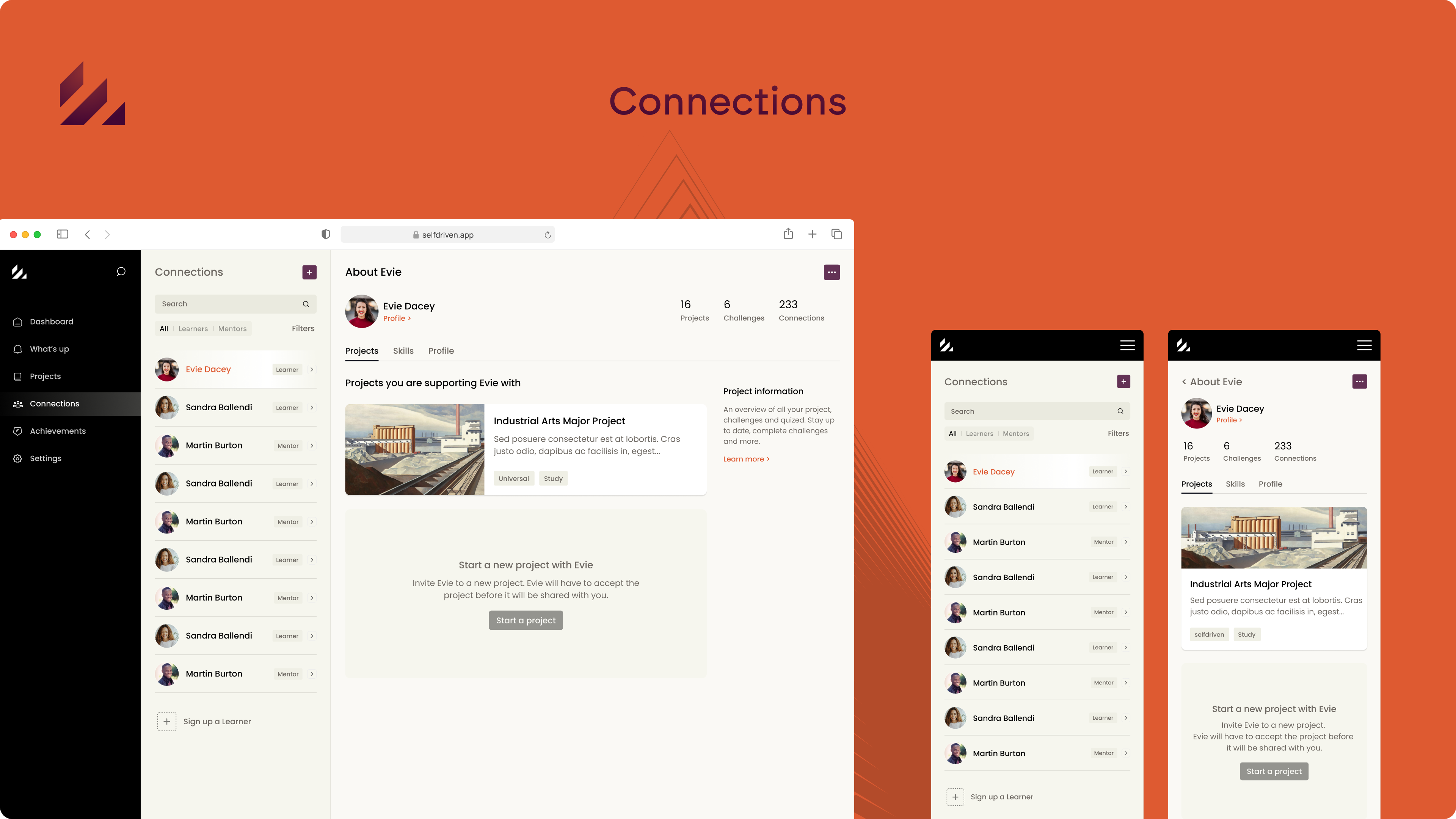
Designing a User-Centered Learning Experience
In the branding strategy, we identified five key personas to ensure Selfdriven’s messaging resonated with all stakeholders. These included Learners, Learning Partners, Facilitators, Community Builders and Ecosystem Partners integrating Selfdriven into their organizations.
However, for the learning platform itself, we streamlined the focus to just two core users: Learners, who engage with projects and track progress, and Learning Partners, who provide guidance, validation, and support. This ensures a clear, user-friendly experience.

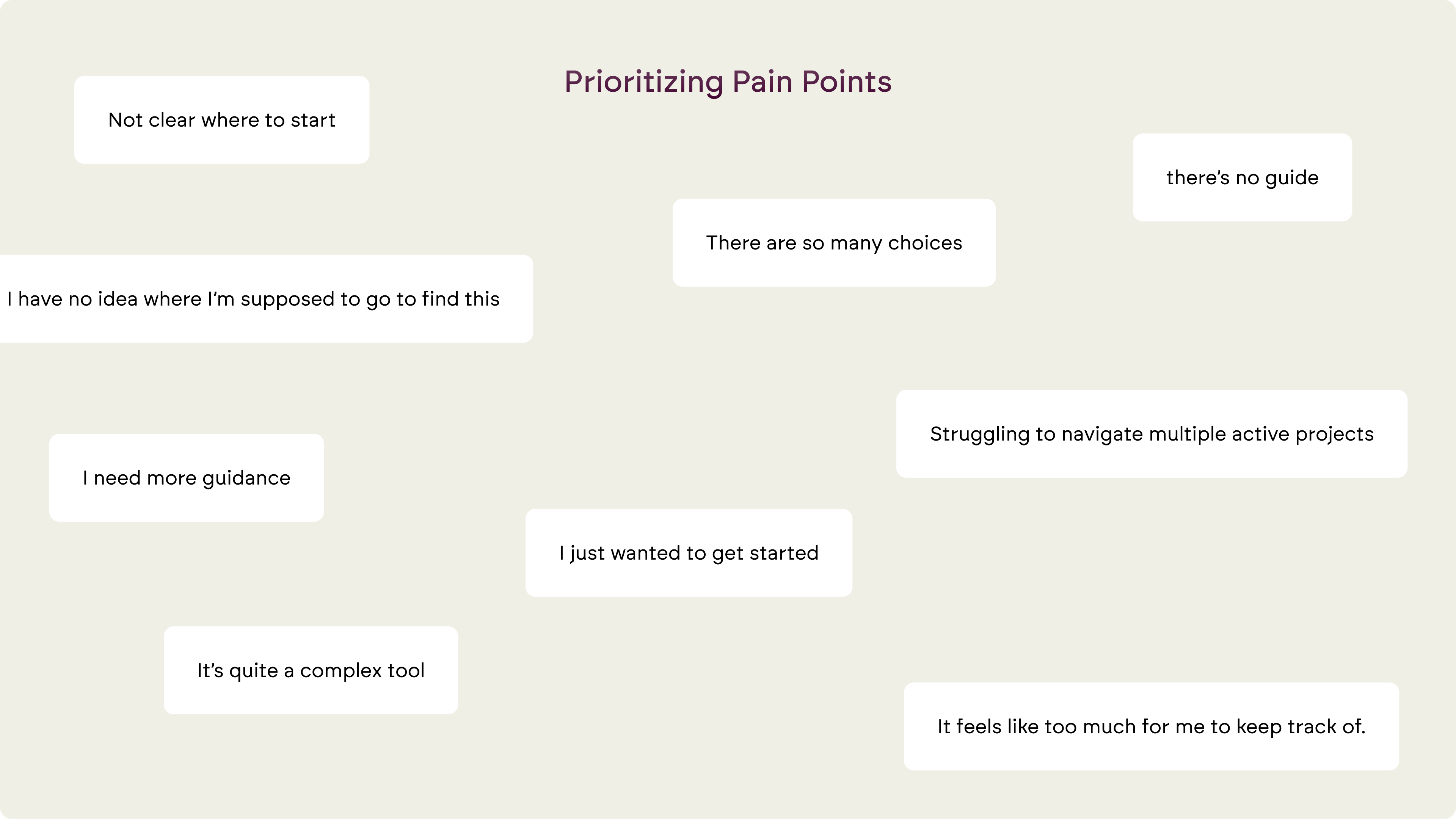
To ensure the platform was intuitive for Learners, we conducted a quick usability test to identify key pain points. The biggest problem was the overload of features and the fact that the user doesn't get any guidance at start.
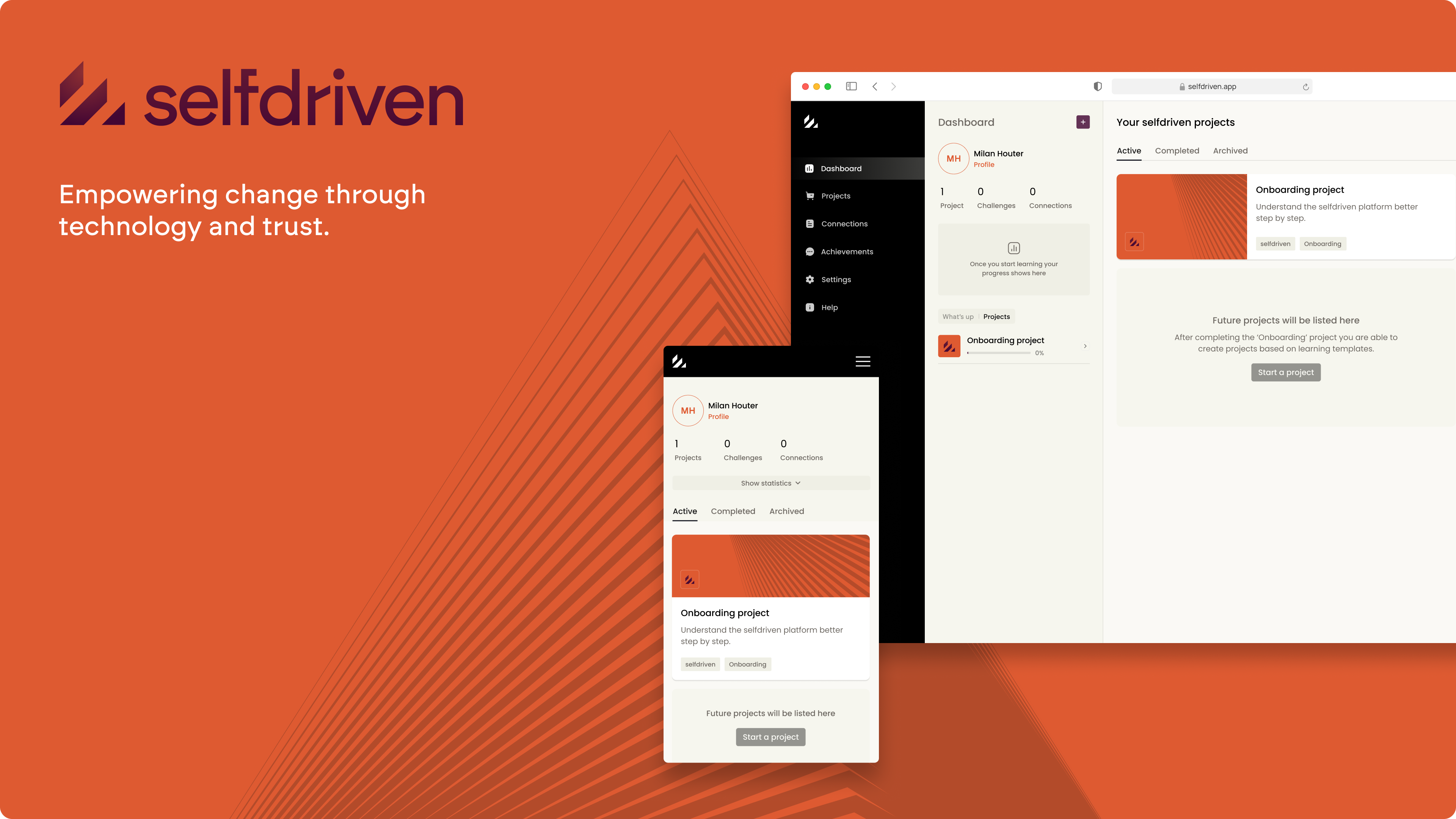
Crafting a new design
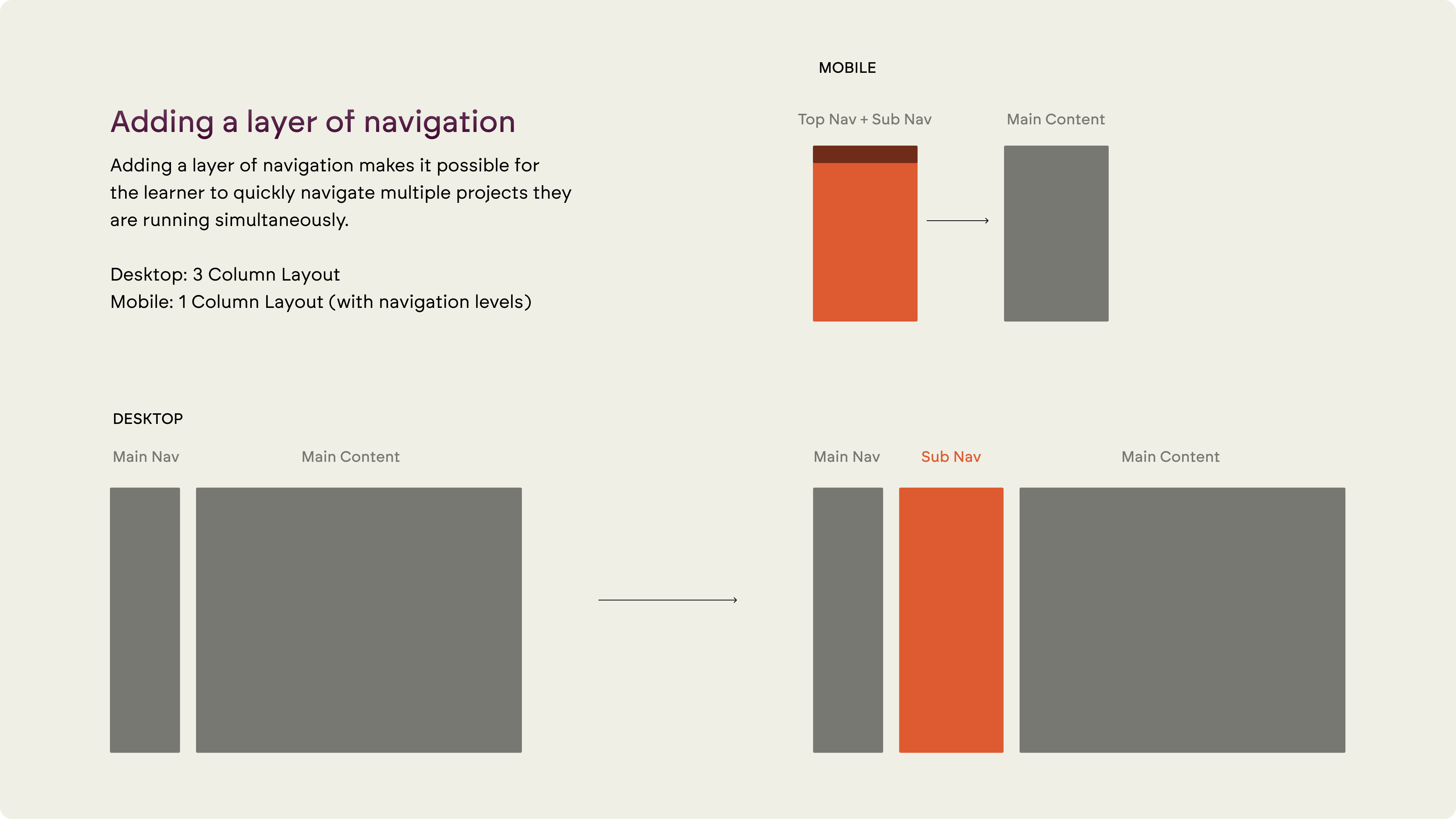
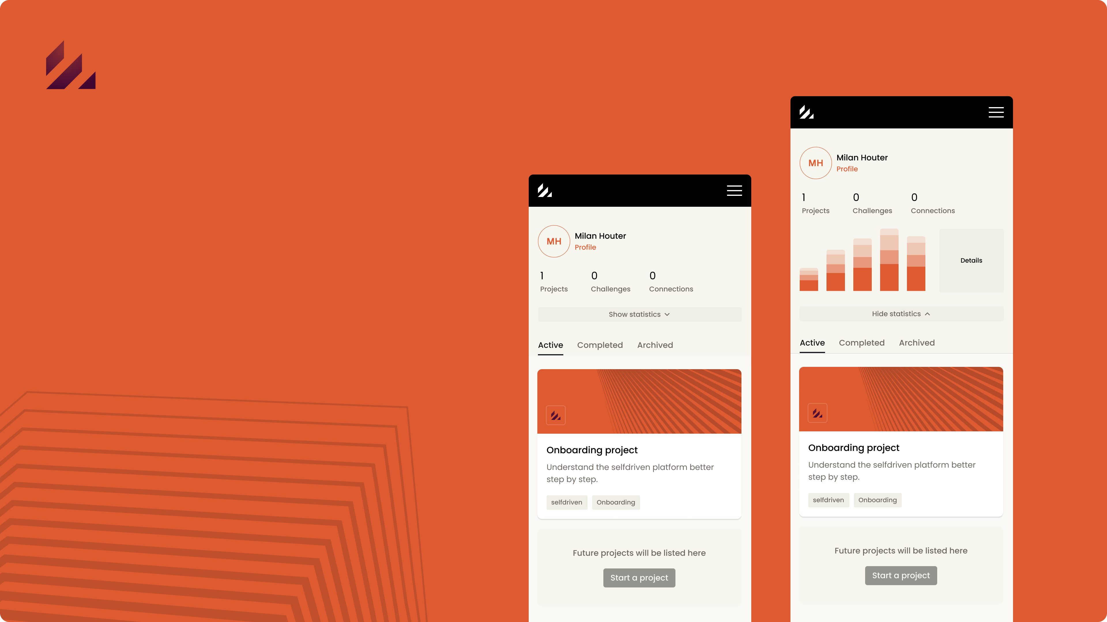
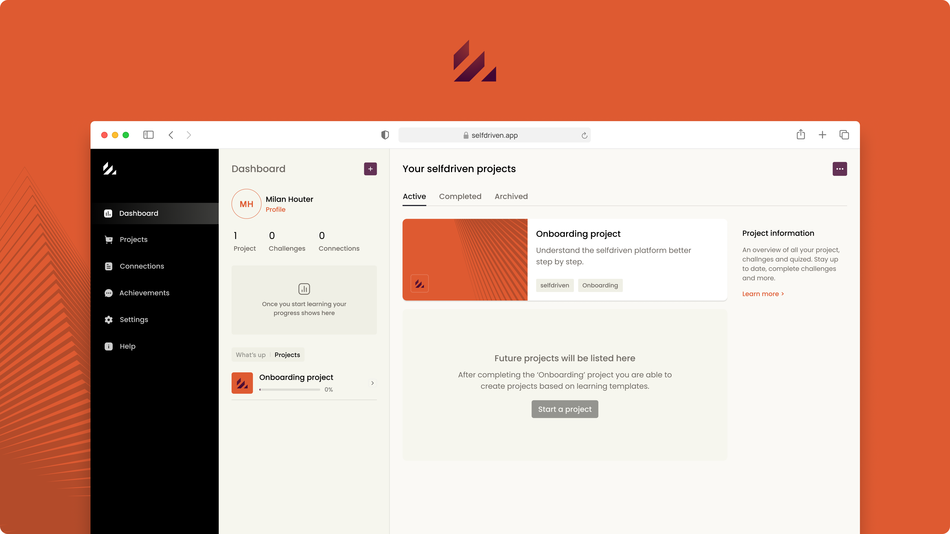
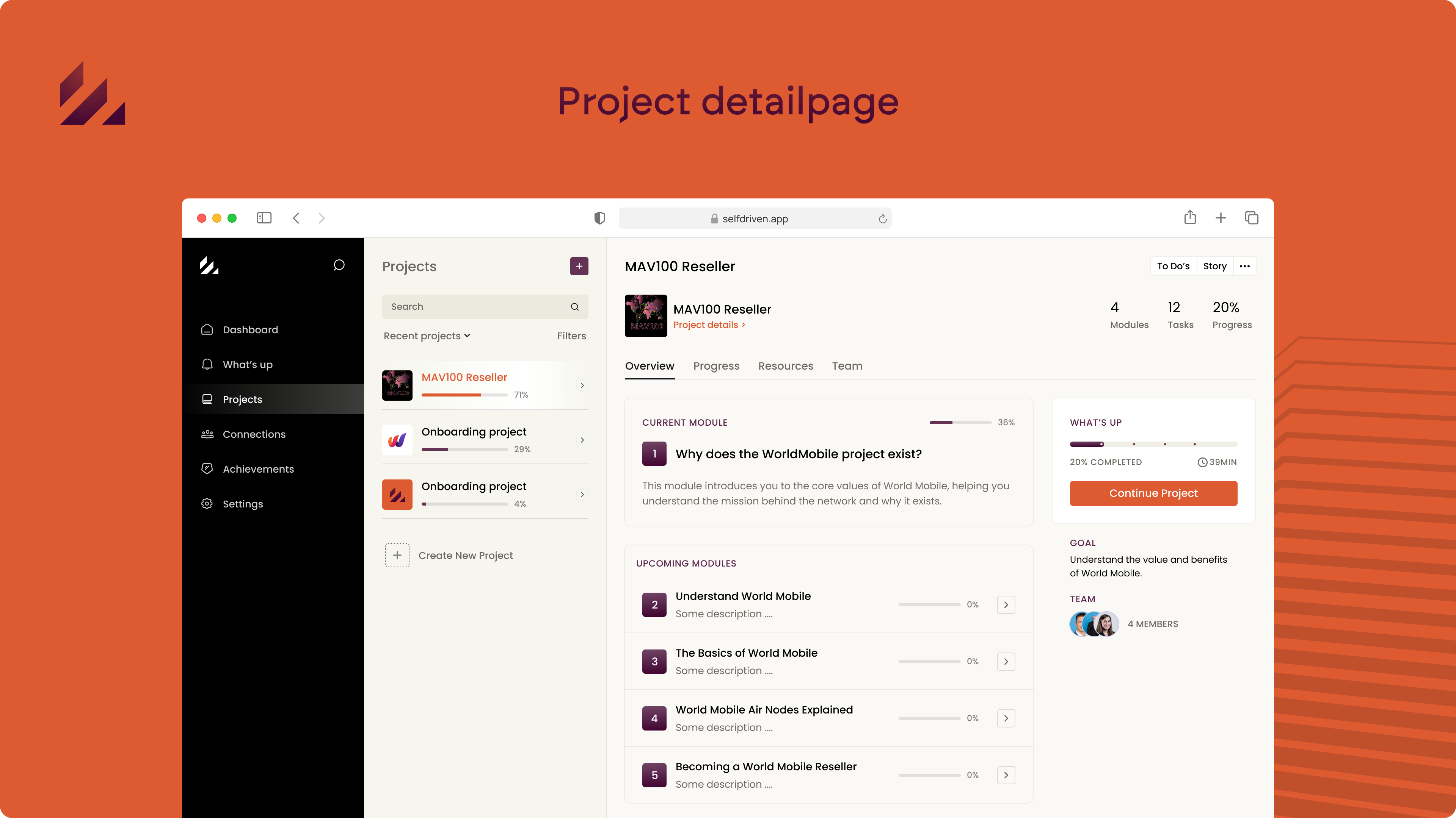
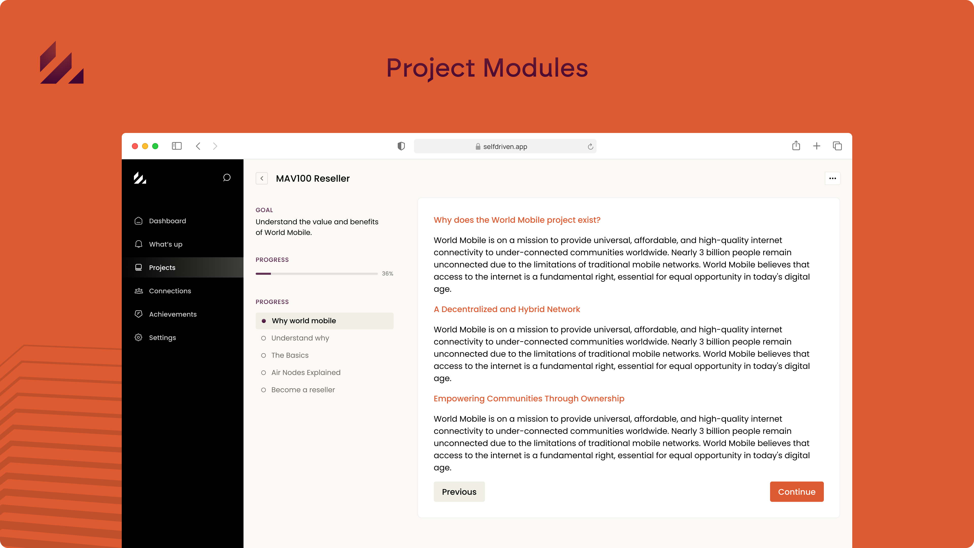
The old platform had too many interactions happening at the same level, which made it hard for users to quickly find what they needed and switch between tasks. To solve this, we’ve redesigned the layout with a three-column structure for desktop and a more adaptive design for mobile.
This approach creates clear sections, making it easier for users to navigate and switch between projects. Plus, it mirrors the layout of popular mailing tools, offering a familiar experience for faster task switching across devices.
Designing the Experience
Instead of starting with wireframes, we went straight to high-fidelity design to create an experience that felt as close to a final product as possible. This approach allowed us to quickly visualize the new layout and ensure a more realistic user experience, which we’ll validate and refine based on user feedback as we move forward.

More to Come: Project in Progress
The design you see is just the beginning! I am still working on testing, refining and adding more screens to enhance the platform experience.